.svg)
Shaping the identity of a modern cosmetic brand
6 Weeks
Beauty
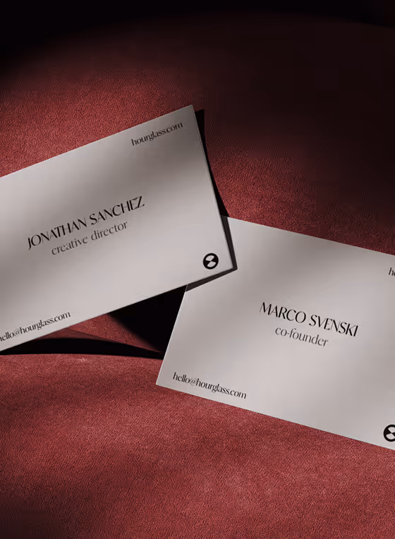
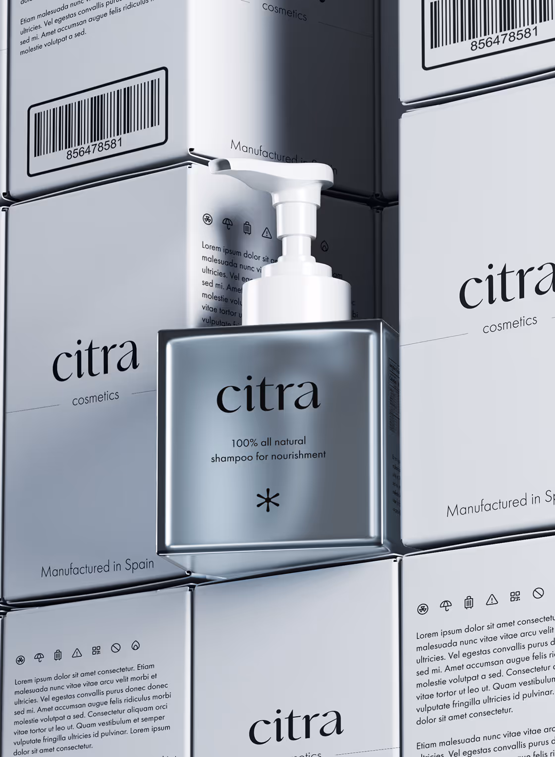
Citra

Citra is a skincare brand that doesn’t raise its voice. It doesn’t need to.
Rooted in the philosophy of quiet luxury, Citra embodies the idea that less can be infinitely more when done right. Our task at Studio66 was to create a brand that feels like a whisper in a world full of noise. A brand that doesn’t chase attention but draws it through restraint, elegance, and intention.
Designing With Intention
We partnered with the Citra team from the ground up, shaping everything from brand strategy and identity design to packaging, art direction, and visual storytelling. The goal was clear: develop a visual language that aligns with Citra’s minimalist philosophy while giving it a unique presence in the skincare space.


A QUIET VOICE, MADE VISIBLE
Every decision from the pared-back word mark to the calming color palette and photography direction was guided by one central idea: this is skincare for those who value clarity, care, and calm. The kind of person who lights incense at 9am, not for Instagram, but for themselves.
We crafted a refined brand mark, balancing modernity with softness. The typographic system was chosen to reflect warmth and quiet confidence, while remaining editorial and versatile across touch points. The color palette evokes natural materials: stone, clay, skin, and creates room for the product to breathe.
We didn’t design for attention. We designed for alignment with people who already live this way and resonate with Citra’s quiet confidence. Every element speaks softly but with purpose, evoking a feeling and shaping a personality that people naturally want to be part of.
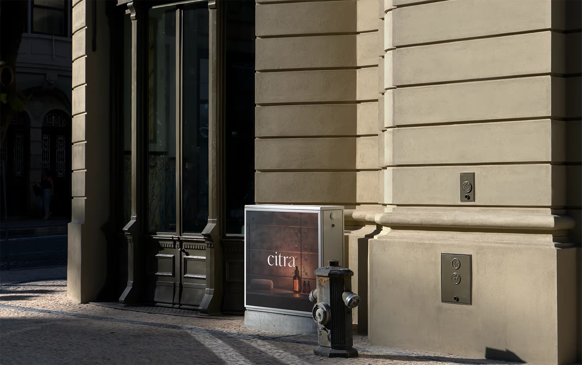
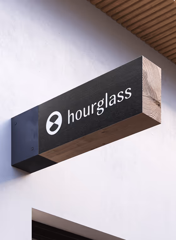
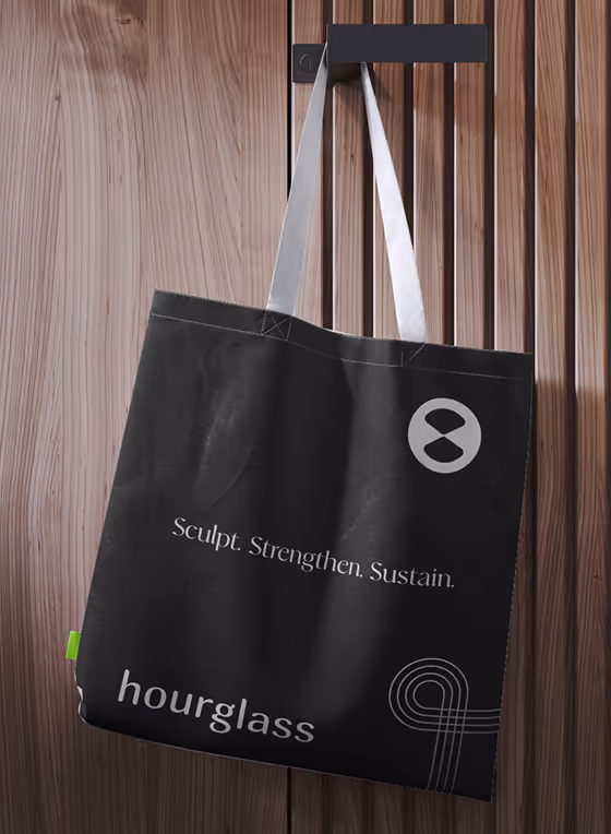
As the brand began to take physical shape, we focused on how it would live in the world, not just in packaging, but in space. Storefronts, signage, billboards, and printed material all became quiet extensions of the same voice: measured, restrained, and undeniably present. The system was designed to scale without losing its intimacy, to make even the largest touch points feel personal.


THOUGHT ~ TOUCH
In parallel, we designed a packaging system that’s understated yet elevated, being grounded in simplicity, built to disappear into daily life. The kind you reach for every morning. Surfaces, shapes, and textures were all considered with daily use in mind. Something that blends into your space, complements your routine, and becomes part of a ritual.
For this project our goal wasn't to create a brand, it was to create feeling through connection. Connecting with those who resonate with Citra - a mood, a pace, a perspective. By leaning into restraint, we created something that doesn’t demand attention, but holds it. Something quietly magnetic that draws you in.


.avif)